

By Charles Buckley 1 and Chrissi Nerantzi2
1 University of Liverpool
2 Manchester Metropolitan University
Cite as: Buckley, C, A. and Nerantzi, C. (2020), "Effective Use of Visual Representation in Research and Teaching within Higher Education", International Journal of Management and Applied Research, Vol. 7, No. 3, pp. 196-214. https://doi.org/10.18646/2056.73.20-014 | Download PDF | Cited by
Abstract
There are now increasing opportunities for educators to use creative forms of visual representation in their professional practice. Despite the potential for increasing researcher and teacher understanding and student engagement and learning through the proliferation of visual material, the rationale and deliberate planning of using images remains relatively unexplored. The potential benefits to learners through the incorporation of visual representation on its own or with text are well-documented although the ways in which it can be used effectively is less well-established. This paper provides an introduction to some of the research into using visual representation within researching and teaching and learning within higher education. It draws on examples from the authors’ own practice to provide insights into a selection of ways in which visual representation might be used in various ways such as generative/analytical techniques and communicative tools. The authors provide two examples of visualised frameworks and models that have been developed and used in the context of academic development; the use of simple relationship diagrams in learning and teaching and dissemination of practice; the use of diagrams to explain complex phenomenon and an example of using images juxtaposed with diagrams and text to present a case for professional teaching recognition.
1. Introduction
Visual communication has become an integral part of everyday life yet this is not mirrored in higher education practices within learning and teaching settings as many classrooms still heavily focus on traditional oral and written instruction (Daniels, 2018). The use of various types of images has been increasing, especially since the incorporation of digital technology, social media and open practices in Higher Education in the UK and more widely. However, the benefits, challenges and opportunities for incorporating such images need clarification. Staffs with teaching responsibilities are increasingly interested in incorporating visual representation into their practices to create stimulating learning experiences for learners in face-to-face, blended and online settings. Presentational software such as PowerPoint, which is a commonly used slideware, allows for the incorporation of images although critics argue that such these are sometimes only used for decoration (Gabriel, 2008) rather than being used in creative ways to enhance learning. Hallewell and Lackovic (2017) for example, explored the ways in which 145 photographs used in PowerPoint presentations were used in 16 UK universities for undergraduate Psychology lectures and found that only 33% were referred to explicitly with the majority representing a case of ‘unprobed representations’, that is, the photograph and its meaning were not explicitly referenced. Furthermore, Carpenter, Witherby and Tauber (2020) argue that students have a tendency to over-endorse the effectiveness of images even when they are only used for decorative purposes leading to them thinking they have learned more than they actually have. Visual aids can enhance learning when they provide additional explanatory information that is relevant to the text (Carney and Levin, 2002).
There has been a growing interest in using visual representation in teaching and work such as that of Mayer (2014) on Multimedia learning offers some guiding principles such as the various ways in which words and pictures can be used to enhance learning as does Jewitt, Bezemer and O’ Halloran (2012) approach to multimedia model of learning using digital technologies. Mayer (2014) proposed the following principles for good practice in the use of multimodal approaches:
- Multimedia principle -- It is better to use both words and pictures rather than just words;
- Contiguity principle -- Words and pictures should be presented at the same time, rather than successively;
- Modality principle -- When associated with an animation, words should be presented orally rather than in print form on the screen;
- Redundancy principle -- The simultaneous verbal and visual presentation of words is to be avoided;
- Personalisation principle -- Words are better presented in a conversational style rather than a formal, didactic, style;
- Interactivity principle -- Learners should be able to control the rate at which the presentation is made;
- Signalling principle -- Key steps in a narrative should be verbally signalled.
The influential theory of Clark and Pavio (1991), the dual-coding theory, has also gained wide acceptance and suggests that it is easier to understand something when we combine verbal and non-verbal elements. The value of the dual-coding approach is that, by providing a description of what happens during learning, it enables us to explain, to some extent causally, what happens in the brain. The activity in the brain is ‘visualisation’ and it operates on models. The implications of this are obvious for teaching in most educational settings including university, especially with an ever- growing interest in enhancing learner experiences.
The presence of visual elements in learning and teaching is increasing as the integration of images and visual presentations with text in textbooks, instructional manuals, classroom presentations, and computer interfaces broadens (Kleinman and Dwyer, 1999). Visual information plays a fundamental role in our understanding, more than any other form of information (Colin, 2012). Colin (2012: 2) defines visualisation as “a graphical representation of data or concepts.” Presenting data, concepts and outputs through a visualisation helps us communicate more effectively complex and often large amounts of information or concepts and identify patterns. It can make information more accessible and visual metaphors can evolve familiar text into something more extraordinary and engaging. Visualisation helps make sense of data that may have seemed previously unintelligible (Stokes, 2001). In addition to this, images evoke an emotional dimension. Harper (2002) argues that, as a species, we began with pictures and progressed to the word, therefore, images can evoke deeper elements of human consciousness. This reflective article explores the authors’ experiences of using various forms of visual representation in their research, academic practice and learning and teaching.
2. Visual representation in the process of learning and teaching
Visual representation has great potential to enhance learning and teaching throughout the many stages involved from researching pedagogical practice, scholarship, linking research and teaching, planning and curriculum development through to presentation and evaluation amongst many others. Curricula should draw on research to stay fresh and can involve the teacher’s own disciplinary and pedagogical research. Growing numbers of academics across disciplines are conducting research in their teaching (Cousin, 2009). The UK Professional Standards Framework (2011) emphasises the importance of using evidence-based approaches and the outcomes from research, scholarship and continuing professional development. Whilst images can arguably provide a visual enhancement to text heavy forms of communication, they can also convey meanings and impact emotions. In addition, images can enhance the learning experience and provide for a more inclusive approach to learning and teaching. The creation of suitable visual materials helps the author to structure and make sense of their own thinking. The process helps “embed representations, using graphical and textual semiotic conventions of their creator’s understanding of a given issue” (diSessa, 2002: 1).
3. Examples
3.1. Visualisation of concepts and models
In the context of learning and teaching in higher education and education more generally, conceptual and empirical pedagogical frameworks and models are evidence-based outputs that are often not just described using written language but also visual. The visualisation of such frameworks and models, often in the form of diagrams, can play an important role in explaining and illuminating key features, connections and patterns that have been identified through research. They can aid the design, implementation and evaluation of specific learning and teaching strategies and become valuable tools during curriculum design processes, including conversation and professional discussions. Other frameworks and models are directly used during the learning process to support specific teaching methods.
In the following sections two examples of visualised frameworks and models that have been developed and used in the context of academic development are reported together with further supporting visualisations related to these:
a) FISh (Focus – Investigate – Share), a learning and teaching aid for online Problem-Based Learningb) A cross-boundary collaborative open learning framework, a curriculum design and evaluation tool with a focus on collaborative learning
a) FISh
In 2012, the openly licensed course Flexible, Distance and Online Learning (FDOL) was developed out of a PGCert in Academic Practice module at the University of Salford by Chrissi Nerantzi in collaboration with Lars Uhlin, a colleague academic developer from the Karolinska Institutet in Sweden to bring together colleagues from different institutions to develop their practice around the themes of the course in a supportive and collaborative learning environment. It was offered for the first time in 2013 and then again twice in 2014 as an informal cross-institutional collaboration among colleagues in these institutions with facilitators and participants from different parts of the world and between 80 and 100 registered participants in each iteration (Nerantzi, 2014).
Problem-Based Learning (PBL), developed in the 1960s at McMaster University in Canada, first for Medical Education (Barrows and Tamblyn, 1980) was selected by the course designers as the underpinning learning and teaching approach to foster inquiry within small groups (8-9 individuals initially) for those who expressed an interest to engage in this way (Figure 1).

The majority of all registered learners participated in groups (Nerantzi, 2014). PBL is a structured approach to inquiry which normally utilises a PBL model. Existing models that were reviewed by the course designers felt too complicated (Nerantzi, 2014). As they felt that something simpler would work better in an online and open environment, they decided to create their own based on the fundamentals of PBL and Mills’ (2006) 5-step model. This is how FISh was born (Nerantzi and Uhlin, 2012).
FISh, is a three-step PBL model that aided PBL group members and their facilitators in FDOL to engage in inquiry in a systematic way based on specific learning scenarios that where either provided or contributed by the groups. This PBL model and its three steps were accompanied by a set of questions that guided PBL group members and facilitators during the learning process. These are:
Step 1: Focus
- What do I/we see?
- How do I/we understand what we see?
- What do I/we need to find out more about?
- Specify learning issues/intended learning outcomes!
Step 2: Investigate
- How and where am I/are we going to find answers?
- What will I do/Who will do what and by when?
- What main findings and solutions do I/we propose?
Step 3: Share
- How am I/are we going to present my/our findings?
- What do I/we want to share with the community?
- How can I/we provide feedback to others?
- What reflections do I have about my learning (and working with others)?
The FISh model is simple and memorable. What makes it memorable is perhaps the name itself. That was intentional. The acronym FISh consists of letters representing the 3 stages of the PBL model: Focus – Investigate – Share. Using FISh as the name of the model, the visualisation happens almost automatically as we think about the word “fish” (Figure 2 depicts the original design). Therefore, one could claim that the FISh model may be a metaphor. FISh has become the model (Geary, 2012). The use of FISh helps us perhaps remember the concept and pattern behind it, the pattern of the PBL process, in a way that perhaps just worlds would not be able to if the designers had selected other words and phrases to characterise the three steps of the model that didn’t create that mental image in our minds.

Later, the hand drawn FISh image was replaced with the following (Figure 3).

The idea behind it was not just to use it as a visual metaphor of the PBL model itself and the three steps but also to provide a worksheet that could be used to capture ideas by members of the group linked to a specific PBL activity, in digital format or as a print-out that could then inform their discussions and help them take decisions and move forward. Participant F5 noted for example,
“I love the COOL FISh illustration. I think that's great. But then I know that I'm a very visual person. My background's graphic design, I like visual metaphor. So I really buy into that. You don't need to be persuaded to buy into that, you know. But it did get me thinking about things in a slightly different way. And it's something that I tried as well, you know, using the visual metaphor idea that you were using.” (Nerantzi, 2017: 173)
The FISh model helped the FDOL course designers provide a simple and memorable PBL model that would be easy to use for the PBL activities and also helped learners who were academics and other professionals teaching in higher education to reflect on their own practice and potentially adopt similar more visual approaches in their own practice with their students.
b) Cross-boundary collaborative open learning frameworkA phenomenographic study into collaborative open learning in two open cross-institutional courses (FDOL and #creativeHE) let to the development of the cross-boundary collaborative open learning framework which has been developed to help practitioners in curriculum development, planning and evaluation activities especially linked to collaborative learning (Nerantzi, 2017; Nerantzi, 2018). The FDOL course mentioned in the previous section was one of the two cases of this study in which the collective lived collaborative learning experience and its qualitatively different variations was explored (Marton, 1981). The analysis led to the construction of specific categories of description their variations as well as the outcome space, the final output of a phenomenographic study, which depicts the logical relationships among the categories of descriptions in a visual way (Marton, 1981). See Figure 4.
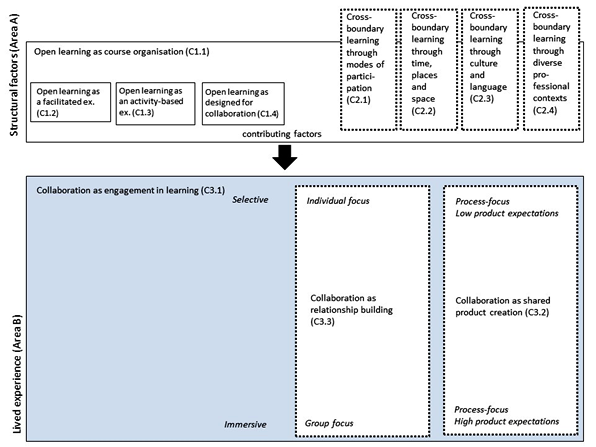
The discussion of the phenomenographic findings led to the development of the cross-boundary collaborative open learning framework. It consists of the following three dimensions. It is presented below (Figure 5) as it was reported for the first time in the doctoral thesis.
o The learning engagement patternso The learning needs
o Design considerations

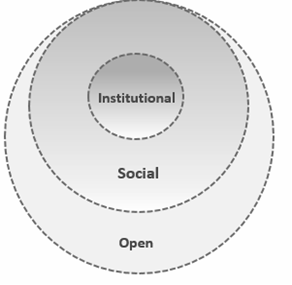
While in Figure 5, the dimensions of the framework have been captured and the key characteristics are communicated, I felt that there was a need to further work on its visualisation to show the relationships among the dimensions with greater clarity. The above separation of the dimensions could perhaps be interpreted as a disconnect, if seen in isolation without the accompanying text. Therefore, in a subsequent publication about the framework (Figure 6), I decided to design and share a more integrated visualisation of the framework. The aim was to illuminate with greater clarity the relationships between the three dimensions and how they influence each other. Moving away from a table format towards a circular representation and using colour to highlight the inter-relationship between the two identified learning engagement patterns and learning needs makes, I feel, the framework more useful a standalone resource and guide during curriculum design and course evaluation activities.

3.2. The use of diagrams to make sense of complex situations and concepts
Diagrams are sense making representations of complex situations although their use in teaching and learning should bear some relation to use within related professional practice. Effective learning and teaching draws on relevant research and scholarship. The range of sub-forms of diagrams is extensive and only a few examples are given in this paper. Through ongoing research experimentation and evaluation of teaching practice, lecturers can evolve and adapt their approaches to enhance the student experience. Visual representation can provide an invaluable tool at all stages of research into teaching. Diagrams, pictures, images, photographs, conceptual maps, matrices, tables and charts not only serve as visual representations of what is being discovered through analysis but also as generative/analytical techniques and communicative tools. Banks and Zeitlan (2015) explain that the distinction between text and image which can be found in textbooks using illustrations is not absolute. There are times, they argue, when the strict linearity of language is insufficient to convey information and visual arrangements of the language need to be considered. Tables and lists are a midway point between the linear flow of language and open-endedness of photographs or picture whereas various types of diagrams and infographics lie nearer to the pure image where text acts as labels although the frame that holds these elements together is less predictable than scientific graphs.
Simple relationship diagrams using Microsoft SmartArt graphics is an easy way of demonstrating the relationships between complex and overlapping concepts. In this instance, as simple relationship diagram (Figure 7) used in a webinar presentation captures the interrelatedness of key criteria, that of evidencing Reach, Value and Impact, in developing an Advance HE National Teaching Fellowship claim. Where Reach is the scale of influence (department, faculty, institution, national, global). Value is the benefit derived for students and staff and Impact is the difference that has been made to policy, practice and/or student outcomes. To give coherence to the claim, it is recommended that the writer identifies a ‘golden thread’ which permeates the narrative across the whole claim.

The authors have also used relationship diagrams in other publications, e.g., in a book chapter on using technology to enhance learning and teaching (Buckley, Nerantzi and Spiers, 2017), the diagram was used to demonstrate clearly to the reader the three dimensions of technology-supported practice as defined by the authors of this chapter (see Figure 8).
The construction of diagrams requires that the creator has a certain level of understanding. Generating diagrams from thoughts or text has many potential benefits and the linking of concepts through the creation of a map requires higher levels of thinking and processing. The amalgamation of text and drawings can act as a powerful tool for the dissemination of complex ideas to critical audiences, but that the use of diagrams still seems to be an area of under-explored potential for the development of theory (Buckley and Waring, 2013).
The important links between research and teaching have received increasing attention in higher education. Healey’s (2004) representation of the research-teaching nexus is used widely and acts as a powerful reflective tool for teachers to think about their own practice. A curriculum which draws on the lecturer’s own discipline or pedagogic research can give the student a connection with the research process and connect with the tutor. The following example draws on the author’s own experience of using diagrams and drawings in research leading to a research-informed approach with students. In the second example the author shows how, following mind-mapping, images and text can be juxtaposed with diagrams and text to present a case for professional recognition through fellowship with Advance HE. The examples are supported with visual representations from the author.
A) Using diagrams from research with young children to explain complex phenomenaTeaching modules on children’s health and physical activity within Sports Science as an academic discipline effectively requires encouraging students to gain insights into the importance of recognising the complexities associated with investigating children’s social worlds. Incorporating diagrams from longitudinal studies the author was able to provide a visual map of the ways in which children perceive sport and physical education (Buckley and Waring, 2013). The diagram below (Figure 9), although rich in text, acts as a powerful reflective tool to show the relationships between codes, themes and emergent categories. This also acts as a useful discussion for emphasising some of the processes associated with different stages of the process of collecting, analysing and interpreting qualitative data. In addition, it can act as a structured stimulus for discussions with co-researchers or critical friends. In research, diagrams helps to show the ways in which categories relate to each other and the rela¬tionship with theoretical codes.

The researcher used the Draw and Write technique (Wetton and McWhirter, 1998) with children interviewed as part of the research. Young Children are more used to visual and written techniques at school, and there should be more attempts to tap into their interests. The advantage of using drawing with children is that it can be creative and fun, and can encourage children to be more actively involved in the research. In addition, the drawings can provide a stimulus for discussion to encourage a more interactive atmosphere in focus group interview situations. In this way, drawings can provide a powerful tool when researching with young children where text or comprehension might be a challenge. The use of drawing gives children time to think about what they wish to portray and can provide a break for younger children who typically have limited concentration spans compared with adults.
Diagrams can be used at various stages of the research process as effective instruments of thought, for organising thinking, looking for relationships in emergent themes and illustrating the ways in which the researcher thinks about the data. Diagrams facilitate both the development and presentation of the researcher’s emerging interpretations or theories and are able to convey meaning in a variety of ways, which is not possible using text alone (Crilly et al., 2006). These diagrams provide an indication of ways in which graphic representation can be used to create a visual map that enables readers to digest key aspects of a sophisticated analysis. They represent emergent theories and can be structured as types of layered diagrams and provide multiple windows illuminating various stages of the research. During the final stages of the study, the Core category diagram (Figure 10) was created to provide a visual representation of the main findings within the Identity Profile continuum. This strategy of generating a diagram is useful for encapsulating the main findings from the research and being able to share these through dissemination at conferences as well as sharing the process with students whilst teaching modules on children’s health in university.

There has been a proliferation of software tools to allow for digital visual representation of thoughts and ideas during the process of constructing and collating complex idea. Mind maps, also referred to as concept maps or spider diagrams can assist in helping the creator to see connections and provide an overview of key points. They can also be a useful tool for revision: for example, MindMeister; miro; Stormboard ; InVision , and Cmap mind maps. These creative planning devices are not new to education and whilst the end product as a material artefact can be useful in communication of ideas, there is pedagogical value in their use as uncovering and organising thoughts, improving creativity and providing an alternative to linear thought processing. As Kinchin (2017: 9) states:
The externalisation of ideas as a concept map allows the developing understanding to be manipulated by the learner without placing impossible demands on short-term memory, and also allows the developing understanding to be shared for peer review and evaluation.
The UK Professional Standards Framework (2011) is now used in many countries as a mechanism for universities to accredit courses which provide a route to professional recognition to achieve a relevant category of fellowship with Advance HE. There has been little scope for colleagues who wish to incorporate various forms of visual representation into their claims and this remains the case for people who apply directly to Advance HE. There is institutional variation in the scope for applicants to incorporate pictures, diagrams, drawings and other forms of visual representation.
In the author’s application to a university for Principal Fellowship claimants were encouraged to think about more flexible approaches to representing their practice and mapping their experience to the PSF. The author began by generating hand-drawn sketches to map experience against the required criteria from the Descriptors in the UKPSF. This then provided a useful artefact for discussion and further development with a mentor. My own application included a PowerPoint slide which was reproduced as an A0 (84.1 x 118.9 cms).
Figure 11 included images and photographs (some of which have been altered for Copyright purposes. The advantage of this type of visual representation lies in that it allows the reviewers to see the clear relationships between the various Descriptors which embody the criteria for Principal Fellowship and the projects and experience covered by the person making the claim.

4. Concluding thoughts
Relationships between concepts, and their contexts, can be more easily and quickly understood using diagrams rather than in textual form (Lowe, 2004). It is claimed people with normal perceptual abilities are predominantly visual (Few, 2015). Lecturers have a responsibility to carefully consider lecture design, to harness visual tools throughout their professional practice. This can lead to a more effective use of increasing volumes of data and visual resources for learning and teaching, as well as support enhanced understanding amongst students and colleagues.
As the examples illustrate, the authors of this paper incorporate visual representation as an integral aspect of their practice. There are a plethora of ways that visual representation can be used in the process in making sense of data and theoretical frameworks; providing prompts for discussion with interviewees, allowing for alternative forms of expression amongst respondents in focus group interviews and visual dissemination of complex findings from projects.
Being competent in the analysis and interpretation of words and numbers is not sufficient in a society dominated by visual images and must be supplemented. Eilam (2012) has argued that information presented to students, including visual representations, needs to be accompanied with suitable teacher critique and guidance for students to develop their visual literacy. The exponential growth of available software and images for use in research, researching teaching and learning and teaching practices has not been paralleled with research into their effective and critical use. As Stokes (2001) suggests, the use of visuals in education, although consistently shown to aid in learning, must be carefully planned. There is a need for more research to gain insights into the ways in which lecturers’ and students’ attitudes, opinions and knowledge can be enhanced through various forms of visual representation to guide future practice.
5. References
- Banks, M. and Zeitlan, D. (2015), Visual Methods for Social Research, 2nd ed, London: Sage.
- Buckley CA (1997), A study of grounded theory identities, childhood identities and the culture of physical activity. PhD Thesis, Loughborough University, UK.
- Buckley, C.A., Nerantzi, C and Spiers, A. (2017), “Chapter 7: Enhancing learning and teaching with technology”, in: Scales, P. (Ed), An Introduction to Teaching and Learning in Higher Education: Supporting Fellowship, UK: Open University Press. pp. 107-116.
- Buckley, C. A. and Waring J. (2013), “Using Diagrams to Support the Research Process: Examples from grounded theory”, Qualitative Research, Vol. 13, No. 2, pp. 148-172. https://doi.org/10.1177/1468794112472280
- Barrows, H.S., and Tamblyn, R.M. (1980), Problem-based learning: An approach to medical education. New York: Springer.
- Carney, R. N., and Levin, J. R. (2002), “Pictorial illustrations still improve students’ learning from text”, Educational Psychology Review, Vol. 14, No. 1, pp. 5–26. https://doi.org/10.1023/A:1013176309260
- Carpenter, S, K., Witherby, A. E and Tauber, S, K. (2020), “On students’ (Mis)judgments of learning and teaching effectiveness”, Journal of Applied research in Memory and cognition, Vol. 9, No. 2, pp. 137-151. https://doi.org/10.1016/j.jarmac.2019.12.009
- Clark, J. M., and Paivio, A. (1991), “Dual coding theory and education”, Educational Psychology Review, Vol. 3, No. 3, pp. 149-210. https://doi.org/10.1007/BF01320076
- Colin, W. (2012), Information visualisation: Perception for design, Cambridge, MA: Morgan Kaufman.
- Cousin, G. (2009), Researching Learning in Higher education: An Introduction to Contemporary Methods and Approaches, New York: Routledge. https://doi.org/10.4324/9780203884584
- Crilly, N.; Blackwell, A.F. and Clarkson, P.J. (2006), “Graphic elicitation: using research diagrams as interview stimuli”, Qualitative Research, Vol. 6, No. 3, pp. 341–366. https://doi.org/10.1177%2F1468794106065007
- Daniels, S. (2018), Praise for Visual Learning and Teaching, Minneapolis: Free Spirit Publishing.
- diSessa. A. A. (2002), “Students’ Criteria for Representational Adequacy”, in: Gravemeijer K., Lehrer R., Van Oers B., Verschaffel L. (eds), Symbolizing, Modeling and Tool Use in Mathematics Education: Mathematics Education Library, Vol. 30. Dordrecht: Springer, pp. 105–130. https://doi.org/10.1007/978-94-017-3194-2_7
- Eilam, B. (2012), Teaching, Learning and Visual Literacy: The Dual Role of visual Representation. Cambridge: Cambridge University Press. https://doi.org/10.1017/CBO9781139026611
- Few, S. (2014), “Data Visualisation for Human Perception”, The Encyclopaedia of Human-Computer Interaction, 2nd edition (online). Available at: https://www.interaction-design.org/literature/book/the-encyclopedia-of-human-computer-interaction-2nd-ed/data-visualisation-for-human-perception [Accessed 2 May 2020].
- Gabriel, Y. (2008), “Against the tyranny of PowerPoint: Technology-in-use and technology abuse”, Organization Studies, Vol. 29, No. 2, pp. 255–276. https://doi.org/10.1177/0170840607079536
- Geary, J. (2011), I is an other: The secret life of metaphor and how it shapes the way we see the world, New York: Harper Perennial.
- Hallewell, M. J. and Lackovic, N. (2017), “Do pictures ‘tell’ a thousand words in lectures? How lecturers vocalise photographs in the presentations”, Higher Education Research and Development, Vol. 36, No. 6, pp. 1166-1180 https://doi.org/10.1080/07294360.2017.1303454
- Harper, D. (2002), “Talking about pictures: a case for photo elicitation”, Visual Studies, Vol. 17, No. 1, pp. 13–26. https://doi.org/10.1080/14725860220137345
- Jewitt, C. Bezemer, J and O’ Halloran, K. (2016), Introducing Multimodality. London: Routledge. https://doi.org/10.4324/9781315638027
- Kinchin, I.M. (2016), Visualising Powerful Knowledge to develop the Expert Student, Rotterdam: Sense publishers. https://doi.org/10.1007/978-94-6300-627-9
- Kleinman, E. B., and Dwyer, F. M. (1999), “Analysis of computerized visual skills: Relationships to intellectual skills and achievement”, International Journal of Instructional Media, Vol. 26, No. 1, pp. 53-69.
- Lowe, R. (2004), “Interrogation of a dynamic visualisation during learning”, Learning and Instruction, Vol. 14, No. 3, pp. 257-274. https://doi.org/10.1016/j.learninstruc.2004.06.003
- Marton, F. (1981), “Phenomenography – describing conceptions of the world around us”, Instructional Science, Vol. 10, pp. 177-200. https://doi.org/10.1007/BF00132516
- Mayer, R. (2014), The Cambridge Handbook of Multimedia Learning. 2nd Ed. New York: Cambridge University Press. https://doi.org/10.1017/CBO9781139547369
- Mills, D. (2006), Problem-based learning: An overview, Available from: https://www.c-sap.bham.ac.uk/resources/project_reports/ShowOverview.asp?id=4 [Accessed on 2 May 2020].
- Nerantzi, C. (2018), “The design of an empirical cross-boundary collaborative open learning framework for cross-institutional academic development”, Open Praxis, Vol. 10, No. 4, pp. 325-342, https://doi.org/10.5944/openpraxis.10.4.907
- Nerantzi, C. (2017), Towards a framework for cross-boundary collaborative open learning in cross-institutional academic development, PhD thesis, Edinburgh: Edinburgh Napier University.
- Nerantzi, C. (2014), “A personal journey of discoveries through a DIY open course development for professional development of teachers in Higher Education”, Journal of Pedagogic Development, Vol. 4, No. 2, pp. 42-58.
- Nerantzi, C. and Uhlin, L. (2012), Flexible, Distance and Online Learning (FDOL) 131 Design, Available from: https://fdol.wordpress.com/fdol131/design/ [Accessed on 2 May 2020].
- Stokes, S. (2001), “Visual literacy in teaching and learning: A literature perspective”, Electronic Journal for the Integration of Technology in Education, Vol. 1, No. 1, pp. 10-19.
- Wetton, N.M. and McWhirter, J. (1998), “Images and curriculum development in health education”, In: Prosser, J. (Ed.), Image-Based Research: A Sourcebook for Qualitative Researchers. London: Falmer Press, 263–283.
